Colour
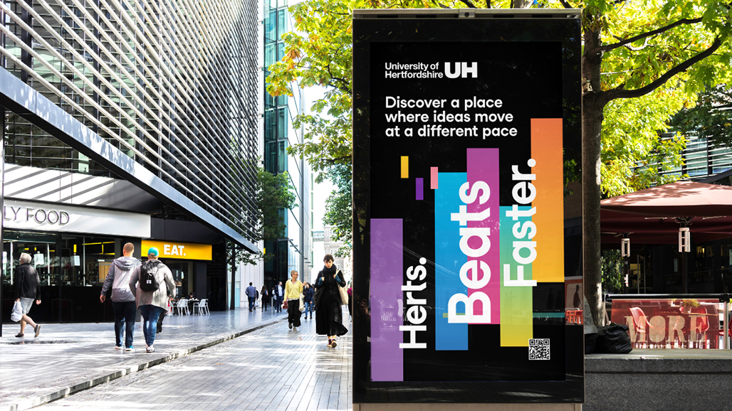
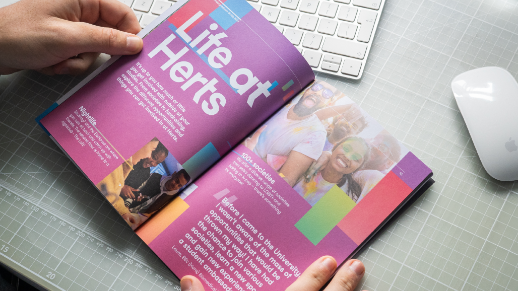
Vital for brand recognition, impact and cut-through, colour is a key feature of our brand identity. Our streamlined colour palette ensures no matter where our audience meets us, we’re distinctly Herts.
Our colour palette
Primary colours
Our primary colour palette should be the default for all main University communications including document creation in Microsoft 365 apps, merchandise, social media graphics and user interface design. Together these colours are undoubtably Herts and will foster trust and engagement in your activity.
Bright Violet
Pantone 2592U
C48 M75 Y0 K0
R154 G70 B207
#9A46CF
Black
Pantone Black U
C60 M40 Y40 K100
R0 G0 B0
#000000
White
C0 M0 Y0 K0
R255 G255 B255
#FFFFFF
Secondary colours
Our secondary colour palette features a broad range of colours selected to complement the primary palette. Colours from the secondary palette should be used only where clear distinction is necessary, for example when visualising multiple series of data, other complex information, or for embellishing designs led by the primary palette. These colours should never be used in place of the primary palette without prior consultation with Marketing and Communications.
Bright Blue
Pantone 306U
C76 M0 Y5 K0
R0 G185 B228
#00B9E4
Bright Pink
Pantone 1787U
C0 M82 Y53 K0
R245 G63 B91
#F53F5B
Bright Yellow
Pantone 123U
C0 M18 Y89 K0
R255 G207 B33
#FFCF21
Bright Green
Pantone 2249U
C70 M0 Y61 K0
R69 G179 B130
#45B382
Bright Orange
Pantone 2012U
C5 M57 Y100 K0
R233 G130 B0
#E88200
Blush Pink
Pantone 196U
C0 M25 Y5 K0
R244 G195 B203
#F4C3CB
Mid Blue
Pantone 285U
C90 M48 Y0 K0
R0 G115 B207
#0073CF
Colour in use
Related Guidance
Get in touch
If you have any questions please contact a member of the team:
| Contact | |
|---|---|
| Studio team, Marketing and Communications | studio@herts.ac.uk |
| Jak Kimsey, Head of Digital and Creative Experience (he/him) | j.kimsey1@herts.ac.uk |
| Marketing and Communications Business Support | marketinguh@herts.ac.uk |


