Our logos
The University of Hertfordshire is a diverse organisation powering students, business and the community through career-focused teaching and internationally renowned research. Our family of logos reflects this diversity and our commitment to each strand of our business.
Our family of logos
Primary logos
Our primary logo comes in two colours: Black and White. To achieve sufficient contrast and legibility, the Black version should be used on light backgrounds, while the White version should be used on darker backgrounds.

School logos
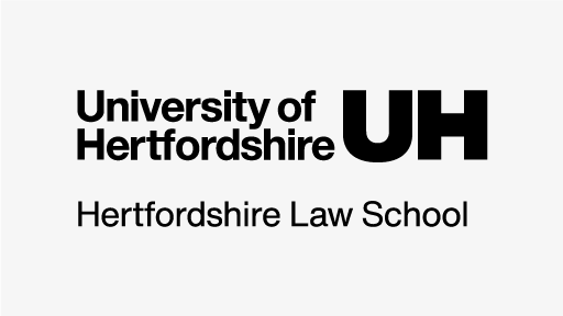
School logos can be used in place of the primary logo where the piece of communication is directly from a School of study, aimed at an internal audience only and contains information related solely to their own activity. If in any cases activity impacts the wider University, the main logo should be used.
School logos are available in Black and White and follow the same usage guidance as the main logo.


How to use our logos
Size
In order to ensure maximum legibility and presence, it is important that the logo is used in a consistent way. The width of the logo is dictated by the width of the communication you are creating. Sizes are specified for a range of standard print formats below. When applying the logo to larger or non-standard formats please scale the logo accordingly and use your discretion to maintain clarity and legibility. The minimum width that the logo may appear at in print is 30mm.
Logo width for commnon print sizes
| Document Size | Portrait | Landscape |
|---|---|---|
| A6 | 48mm | 55mm |
| A5 | 56mm | 64mm |
| A4 | 68mm | 78mm |
| A3 | 96mm | 110mm |
| A2 | 136mm | 156mm |
| A1 | 192mm | 220mm |
| A0 | 272mm | 312mm |
| Roll up banner | 400mm | N/A |
Exclusion zone
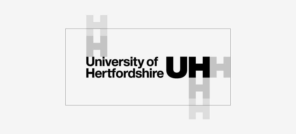
A minimum exclusion zone should be used to keep the logo clear of any other visual assets and safely within the live area. This is constructed using the H from the UH elements as detailed below.
Position
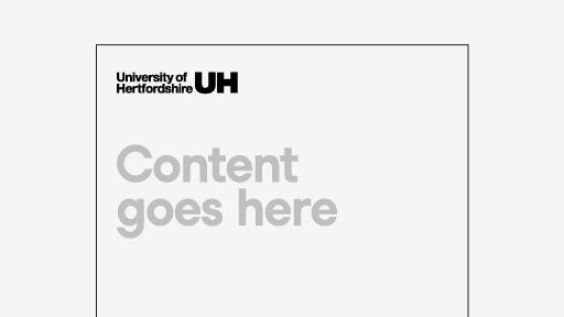
When considering the position of our logo, we embrace flexibility while ensuring consistency and visibility. The logo position should respond to the alignment of content, meaning the logo can appear in any corner, or centred to the top or bottom, as defined by the overall layout.
If the majority of the content is left-aligned, the logo should be positioned accordingly. Similarly, if your content is centred, centre the logo. Adhering to the alignment of the existing elements ensures a cohesive and visually appealing design throughout the document.
Top left logo position
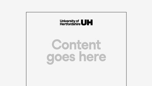
Logo positioned top center

Top right logo position
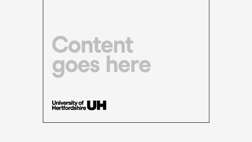
Bottom left logo position

Logo positioned bottom center
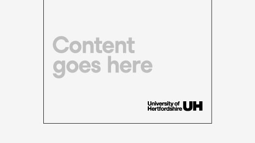
Bottom right logo position
Dos and don’ts
To ensure consistency and to protect our brand, it is vital that the logo is only used as detailed in these guidelines. The examples below are not exhaustive – if you are unsure about use of the logo, please contact Marketing and Communications.

Do: use the logo in approved colours, with no amendments

Do: ensure maximum contrast with background by using white logo on darker backgrounds

Do: ensure maximum contrast with background by using the black logo on light backgrounds
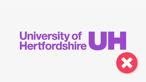
Do not: retouch, recolour or otherwise amend the logo
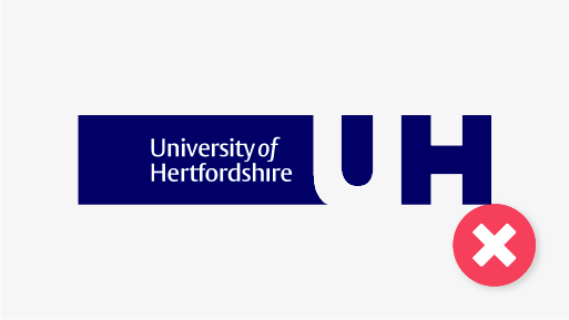
Do not: use previous versions of the logo

Do not: use legacy wide versions of sub logos
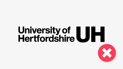
Do not: use versions of the logo sourced online, as these may have been recreated by third parties

Do not: rotate the logo
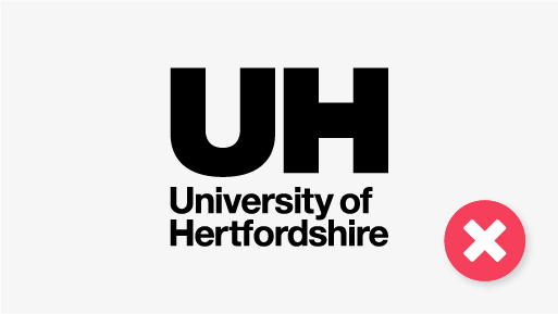
Do not: deconstruct the logo
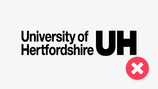
Do not: stretch or condense the logo
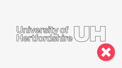
Do not: outline the logo
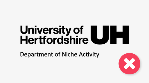
Do not: create your own sub logos
Social media profile images
All social media accounts managed by the University, its schools and departments should use an official social media profile image. Our family of social media profile images reflects the level at which users engage with the University, from central accounts with broad reach to local activity with specific audiences.
It's important our social media accounts maintain consistency, as this protects the integrity of the information the account posts (gaining trust from your audiences), assists in brand recognition and audience relevance and strengthens our digital presence.
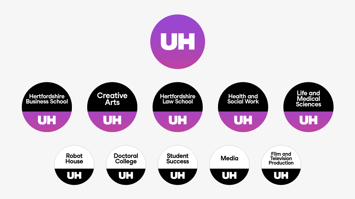
Accounts managed by the central Social Media team in Marketing and Communications carry the short form University logo for maximum impact at a small scale. Recognising the importance of academic communities, we provide bespoke profile images for School-level accounts which act as partners to the main University accounts. Additional accounts for more localised activity should be agreed in collaboration with the Social Media team, and will be provided with their own profile image as part of this connected family.
For more information on creating and maintaining social media accounts, please see our Social Media guidance.
Downloads
Related Guidance
Get in touch
If you have any questions please contact a member of the team:
| Contact | |
|---|---|
| Studio team, Marketing and Communications | studio@herts.ac.uk |
| Jak Kimsey, Head of Digital and Creative Experience (he/him) | j.kimsey1@herts.ac.uk |
| Marketing and Communications Business Support | marketinguh@herts.ac.uk |
